Go back

Research

Graphic Design

Ocotober '24 | CW: Mentions of Suicide

A short class (1.5 weeks) in which the focus was put on understanding object placement in visual content. A class in which we studied the manipulation of imagery by focusing on Rhetorics, Semiotics & Gestalt

Jump to project

Overview

Seeing visual elements in a new light: A dip into Rhetorics, Semiotics & Gestalt.

ClubSafe is dedicated to improving the safety of students and young adults in clubbing environments. Through a comprehensive approach, the organization promotes responsible behavior, implements safety protocols, and provides resources for informed decision-making. By addressing the unique challenges of this demographic, ClubSafe plays a crucial role in fostering a secure and enjoyable nightlife experience.

Starting Projects

For the site, I wanted to use a scroll-jacking technique to not only present information in a progressive disclosure manner but also to make the site more interesting and interactive. Next to this addition I also added 2 "exercises" in which readers can bring their own input to the table.
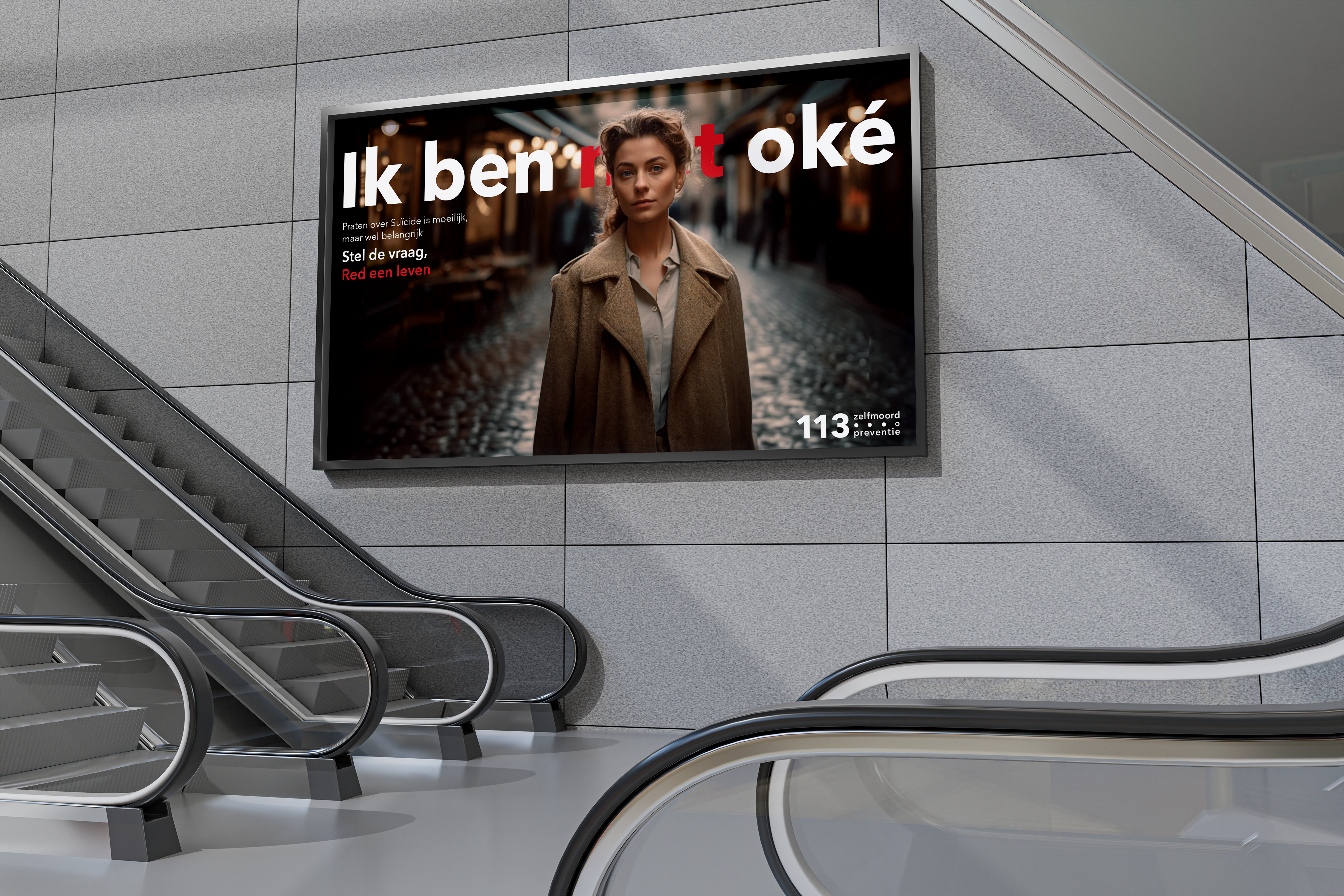
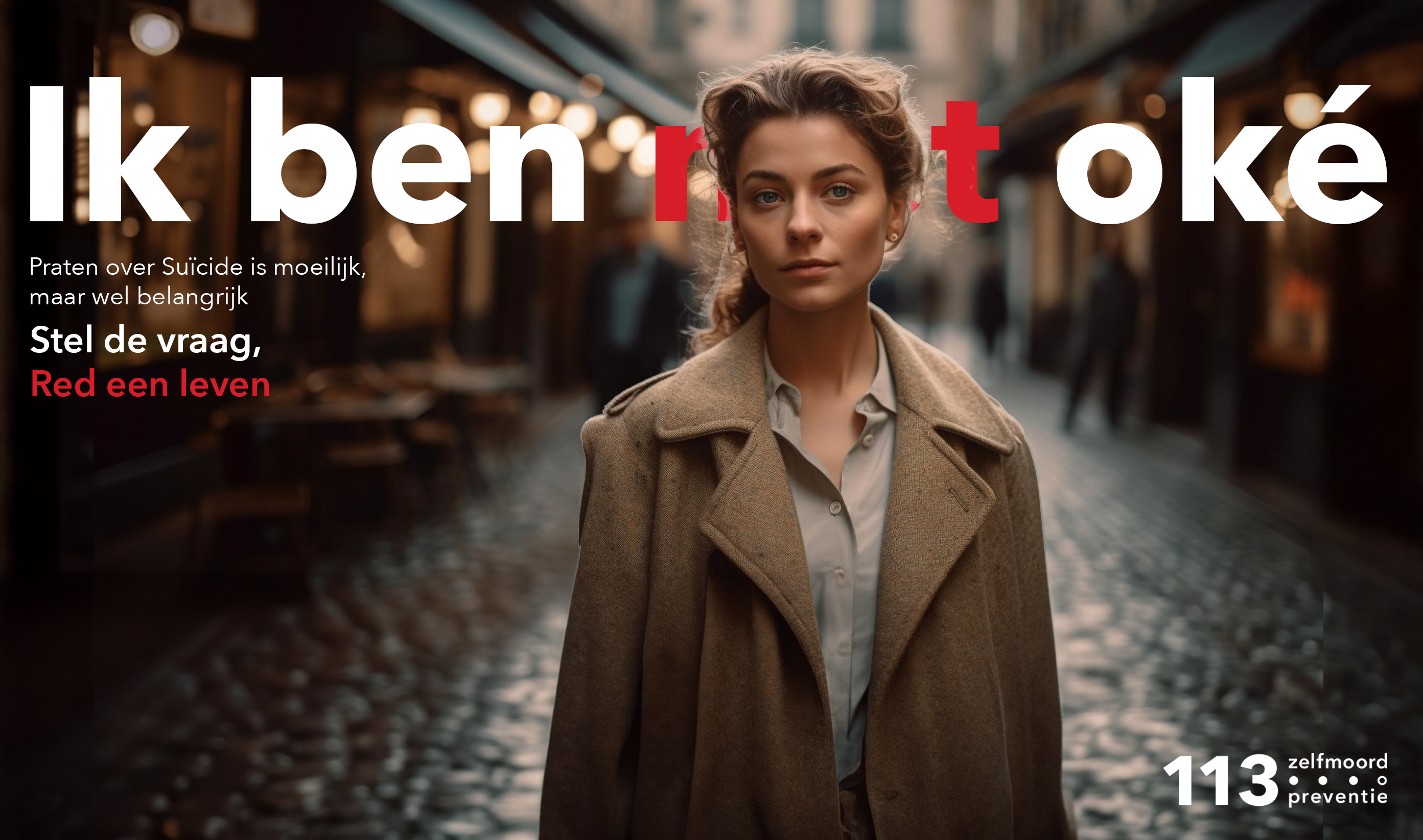
Semiotiek Light

In the first element users are presented with two conversations. In it's core, the two conversations are the same. The only difference between them is the language used. Users can interact by picking the conversation they feel is the most human and get feedback on their choice.
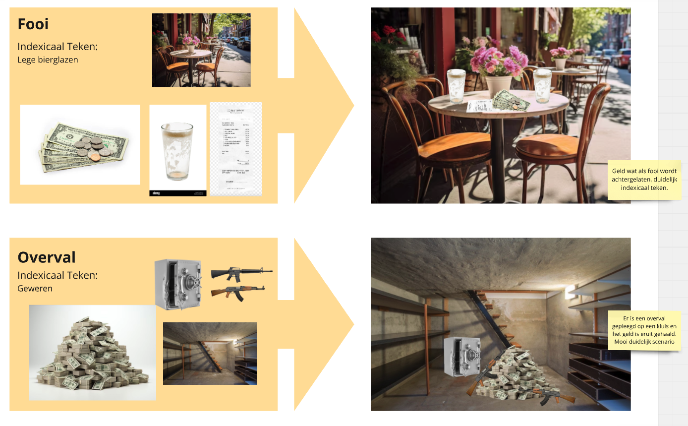
Visual Rhetorics

This element gives the user a qoute with 2 words that they can change by clicking on the words. Users will actively change language in this exercise. The word "depression" will be changed into "a sad and empty feeling" and "social-anxiety" will be changed into "behaviour and emotions when going outside". Showcasing how easy it is to impactfully change your language.

Final Project

The process began with extensive research into who Karel Martens is and what his work entails. This was followed by a period of experimentation, where various designs, ideas, and combinations were tested. Several color palettes, fonts, and different works were incorporated into my own design. The assignment also required creating a personal logo and icons. Karel Martens often uses bright colors, which I adore. Ultimately, I developed a website that I believe distinctly reflects both Karel Martens' style and my own.

Go back up